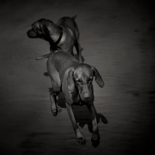
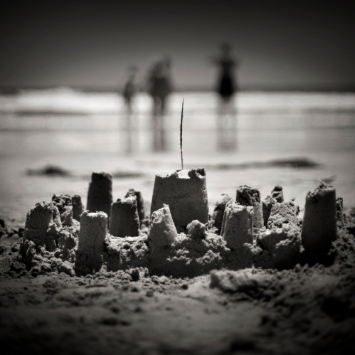
I need to stay accountable to my photographic passion. There’s no better way to do that then to get other photographers together and assign a weekly project that we all show one another and then discuss the outcomes as a group. We are accountable to ourselves and the group! So here’s my first project for the group critique. Hope there will be many more to come.
Coldstone Creamery is a client we’ve worked with for quit awhile. Every time we shoot I enjoy the process as well as the sweet taste of every item we shoot. Here are the last couple of seasonally promos followed by some behind the scenes snaps!
How it’s done:
Thanks goes out to Jana, Robb, Andrew, Kim, Jill, Kate and Rob.
TriVita is a company designed for the greater wellness of its customers. TriVita makes products and dispenses information to better the awareness of the physical, emotional and spiritual health of the folks that buy their products.
I had the opportunity this past September to create a series of product images with and without water effects and splashes. A big thank you to TriVita and the creative director as well as my two great assistants who were responsible for the water rigging. The site home product page.
ASSIGNMENT: New packaging for long time client Bar-s Foods. Make our Hot Links, juicy, plump but don’t burn them…and most importantly make them pop off the grocery store shelf.
This was the directive from the marketing and creative services folks. We needed to create a way to control the fire coming from our make shift BB-Q set up. Our friend Jeff Sears from Southwest Scenic Group came up with a plan. Jeff put together a series of 3 valves along with hand-made burners with various size openings. This enabled us to control where the flames were, how high they would reach and give us the ability to turn them on and off quickly to avoid trashing the styled product.
Here are the shots and how they fit into the final packaging:
And here were some other possibilities as well:
Some behind the scenes stuff:
Yours truly and two of the best clients in town! Thanks to my crew of fantastic assistants and kudos to my stylists…
Sometimes a product just screams how to be lit. It was a dream come true shooting white geometric shapes on dark backgrounds…lots of fun with texture, highlights and shadows. We worked with Davidson and Belluso advertising creating images for their client Techlite Acoustics website. Here are screen shots of some of the pages as well some of the images.
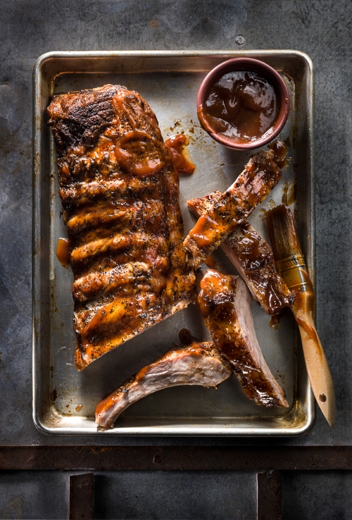
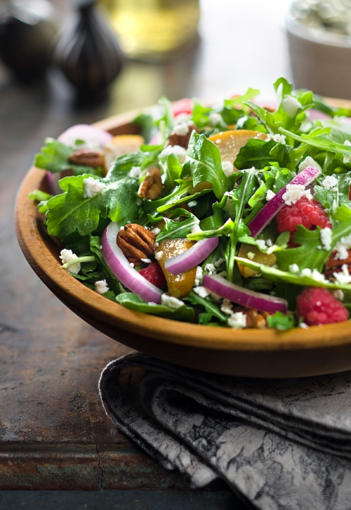
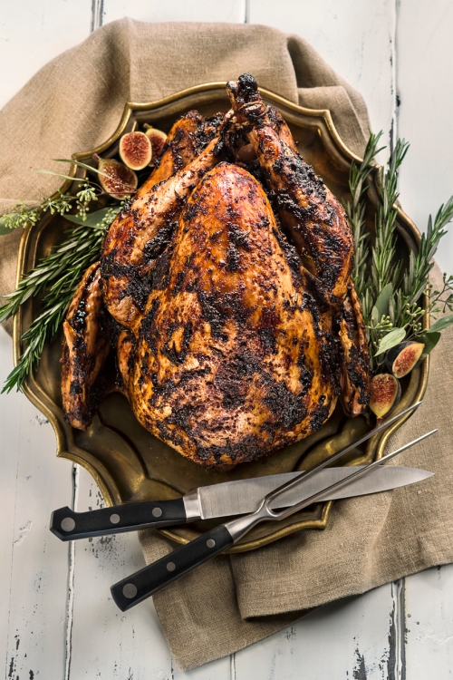
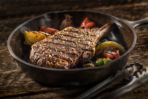
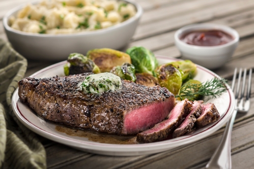
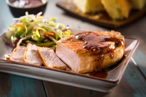
It’s time to share some new work. We’ve been busy shooting some large food projects for Sprouts holiday recipes and store promotions as well as new branding photos for Shamrock Foods launch of their high-end beef, poultry and fish product lines.
It’s the season of all things food, family and fun. Happy Holidays!!
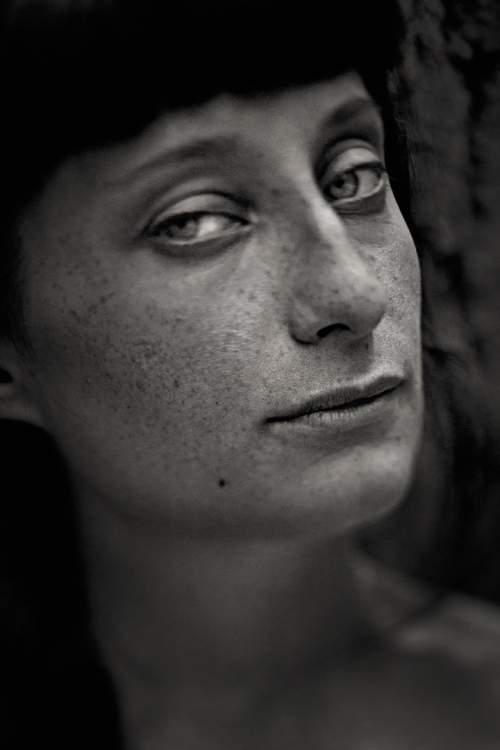
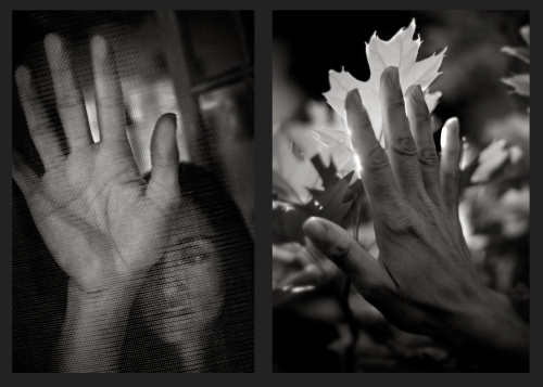
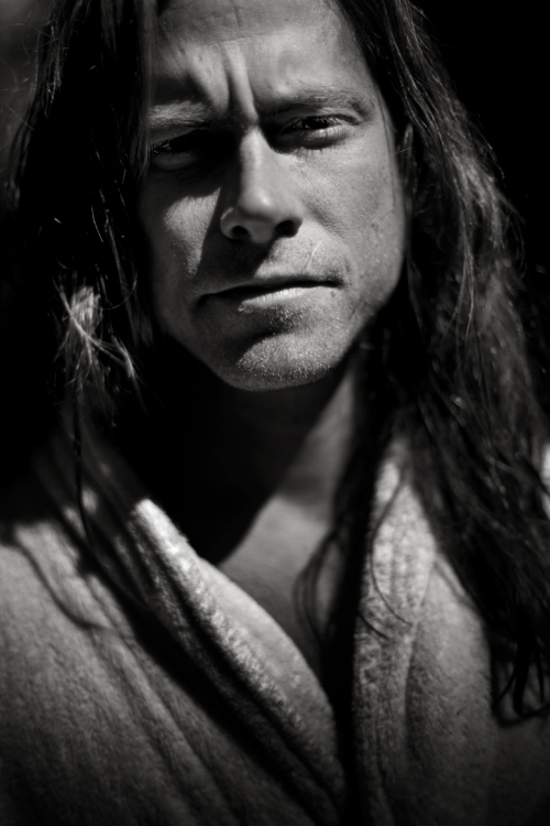
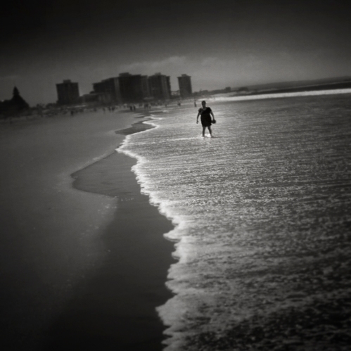
The workshops have been in existence for 30 years. I’ve heard only good things about them and finally decided to sign up for “The Poetry Of Perception” led by Keith Carter. I must say between the insights into the personal approach to image making and my workshop classmates it was a truly amazing experience..in many ways life changing.
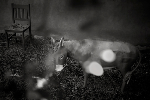
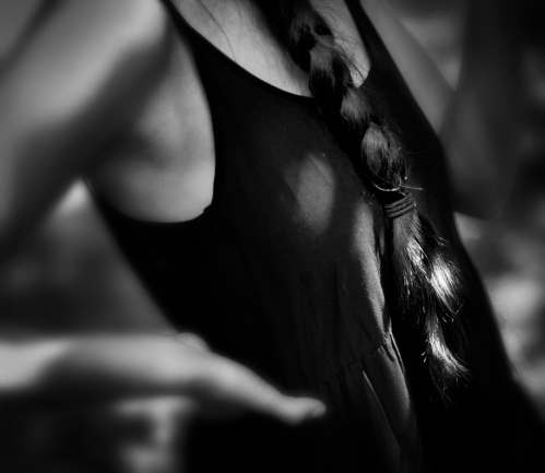
Over the last couple years I’ve been shooting a lot of personal projects because essentially that’s what got my excited about photography in the first place. I joined forces with two great photographers, David Moore and Art Holman and as a trio we give each other assignments, make prints and critique our work…this keeps us honest and accountable to one another to produce images.
The wisdom I carry from the experience is simply this: Be a brave image maker…don’t dwell, you have a life time to figure out what your photographs mean…there are no surprises in perfection…your photographs are your autobiography.
The images below are from assignments given while at the workshop and some images since I’ve been back.
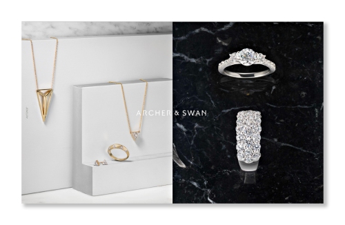
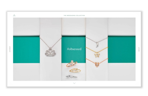
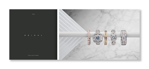
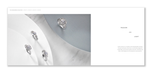
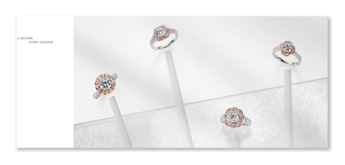
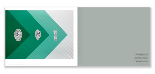
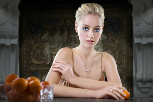
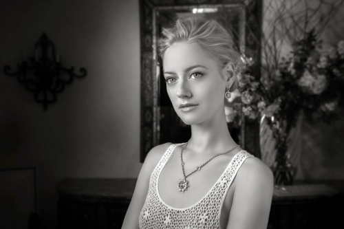
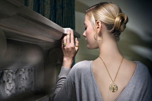
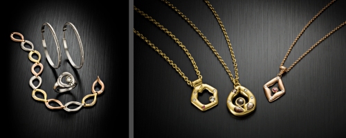
I’ve neglected my blog for the last several months…been busy with work and lazy with the blog! I’ve recently been shooting a lot of jewelry. I want to share 2 recent projects. The first one came from Grip Design in Chicago for Archer & Swan Jewelry. We produced images for the website, look book and brochure. They were great to work with and the ideas were strong. We also have worked on several projects for the local custom jewelry firm 65 Allure. Images were created for their website and ads.
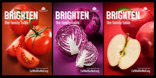
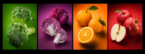
We just recently completed a project for Moses Inc. for their client Arizona Department of Health Services which included some recipe shots as well as images for the “Eat Well Be Well” campaign. The campaign included bus shelter ads and billboards.
These are a few of the bus shelter ads:
These are some of the photos:
Here’s a behind the scenes video during the recipe shoot:
The old is a promo poster I recently found while going through some boxes. It was a poster I sent out to announce that the studio was going digital…think that was back in the mid 1990’s. The design was by Steve Ditko and the illustration including the type was created by Frank Ybara. I had totally forgotten about the poster…just love what Frank did. Finding it made me laugh out loud!
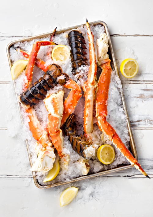
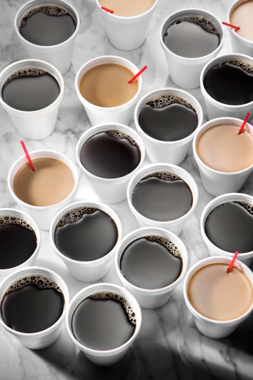
The new is a couple of sea food shots done for Sprouts Famer’s Market and a few coffee shots I did for myself.